Managing modern endpoints at scale requires not just great tools, but also deep visibility into your infrastructure. Microsoft Intune already provides powerful endpoint management capabilities — but organizations often struggle to turn the raw data into actionable insights.
That’s where our custom Microsoft Intune Endpoint Analytics Power BI Report comes in. Built on top of the Intune Data Warehouse API, this report provides a single pane of glass for your entire Intune tenant — from historical changes, device compliance, user activity, connector health, security posture, and more.
With intuitive navigation, page-specific slicers, and visually rich dashboards, this solution is designed to help IT, security, and business leaders monitor, analyze, and optimize their Intune environment.
Let’s take a tour through the report’s pages and features.
1. Cover Page – Your Central Launchpad
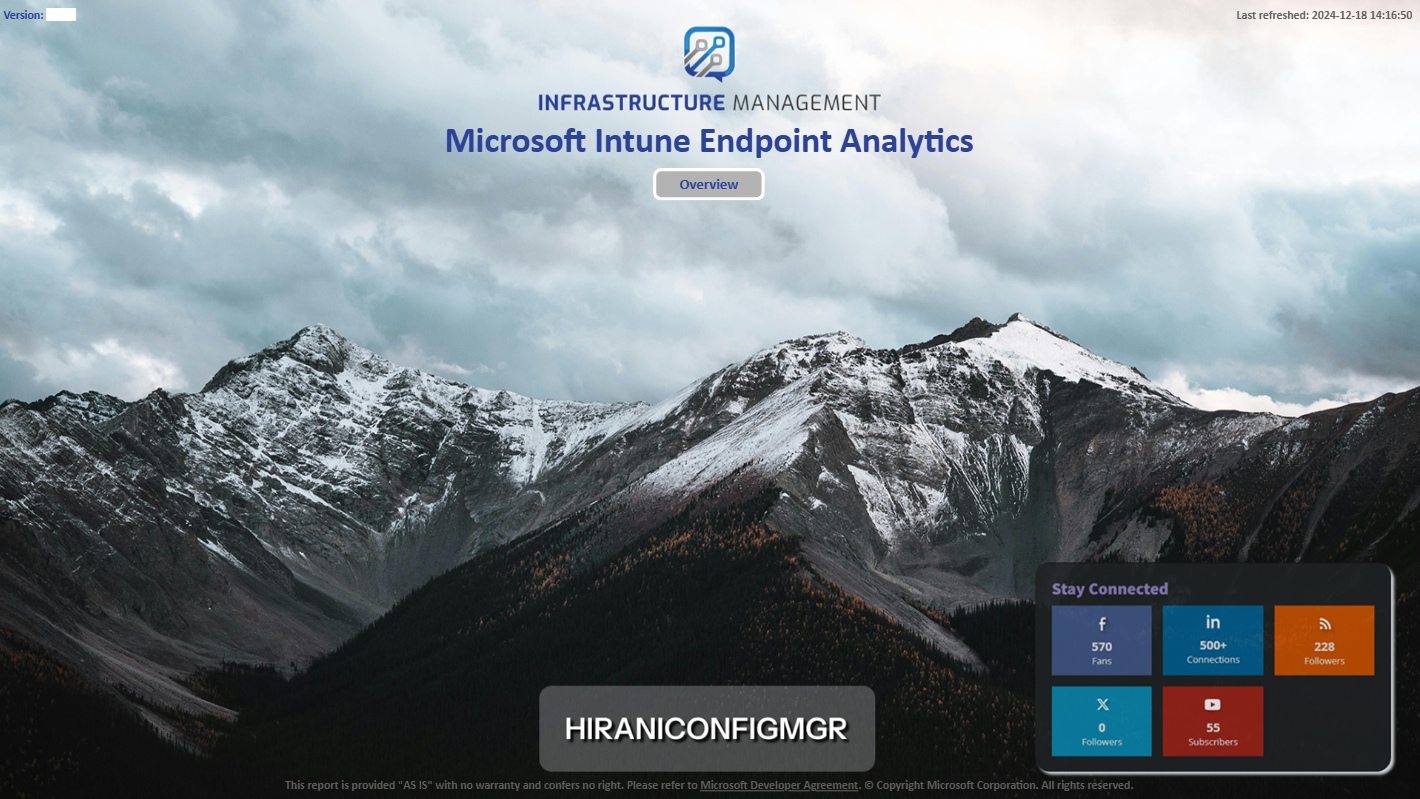
The journey starts with a visually engaging cover page that introduces the report and gives direct access to Overview.
- Clean, professional design featuring your brand identity.
- Quick-action buttons to navigate directly to the most critical areas.
- Always shows the current report version and last refresh timestamp to ensure stakeholders know they’re looking at up-to-date data.
This sets the stage for a seamless user experience.
2. Navigation Menu – Effortless Movement Across Pages
A consistent navigation sidebar appears across every page, making it simple to jump between key report areas:
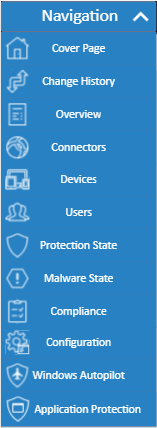
- Cover Page
- Change History
- Overview
- Connectors
- Devices
- Users
- Protection State
- Compliance
- Configuration
- Windows Autopilot
- Application Protection
This ensures decision-makers and admins can get to the right insights without hunting through multiple menus.
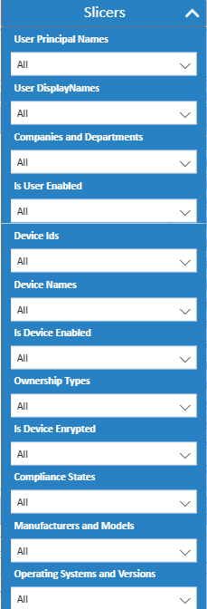
3. Page-Specific Slicer Panels – Maximum Flexibility
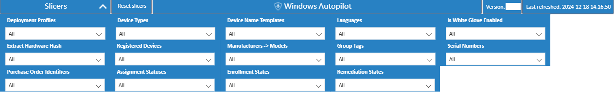
Every required page comes with its own slicer panel, tailored to the context of that page.
For example:
-
On the Devices page, filter by OS version, encryption state, compliance state, or manufacturer.
-
On the Users page, filter by user principal name, department, device ownership, or compliance status.
This ensures every report view can be customized on-the-fly to answer specific business questions.
4. Overview – A Complete Health Snapshot
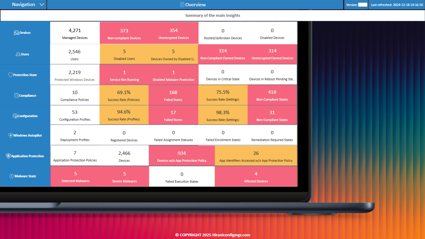
The Overview page is a one-stop dashboard for executives and IT leaders. It summarizes the most important KPIs across your tenant:
- Devices: Total managed devices, non-compliant devices, unencrypted devices, rooted/jailbroken devices.
- Users: Active users, disabled users, non-compliant devices tied to disabled accounts.
- Protection State: Windows protection health, malware detection, service status.
- Compliance: Policy success rates, failed states, non-compliant breakdown.
- Configuration: Profile assignment success and failure rates.
- Windows Autopilot: Deployment Profiles, Assignment & Enrollment States.
- Application Protection: Devices covered/uncovered by app protection policies.
- Malware State: Detected and severe malware cases.
This page delivers a C-level snapshot of your Intune tenant health in seconds.
5. Connectors – Ensuring Seamless Integrations
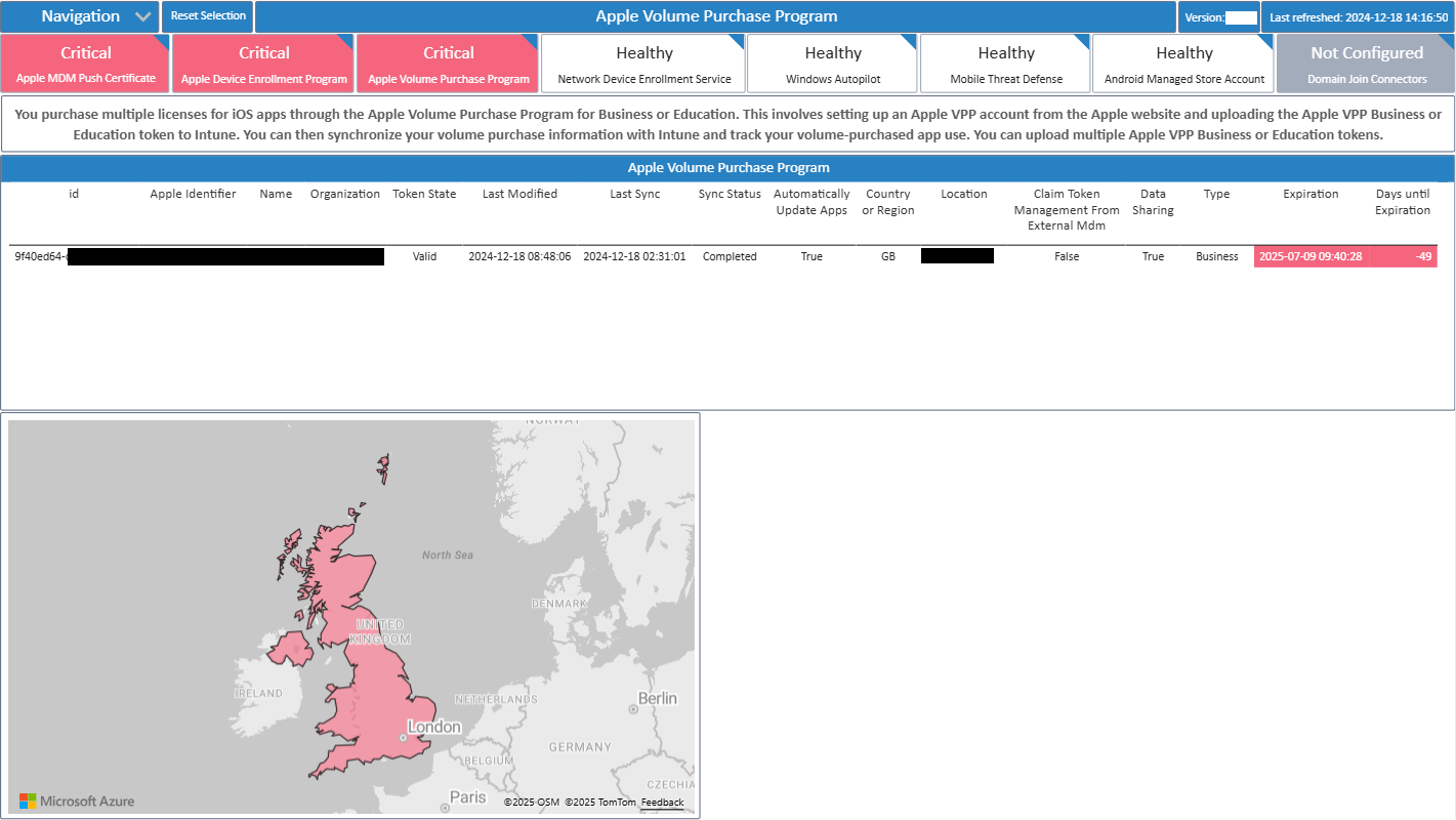
Intune relies on multiple external connectors like Apple Push Certificates, Apple Device Enrollment Programs, and VPP tokens.
The Connectors page highlights their status and expiration dates, with clear categorization into Critical, Healthy, or Not Configured.
- Instantly identify expired or soon-to-expire certificates (avoiding service disruption).
- View geographical deployment of Apple VPP tokens on a world map.
- Ensure business continuity by proactively managing dependencies.
6. Managed Devices – Deep Dive into Endpoint Health
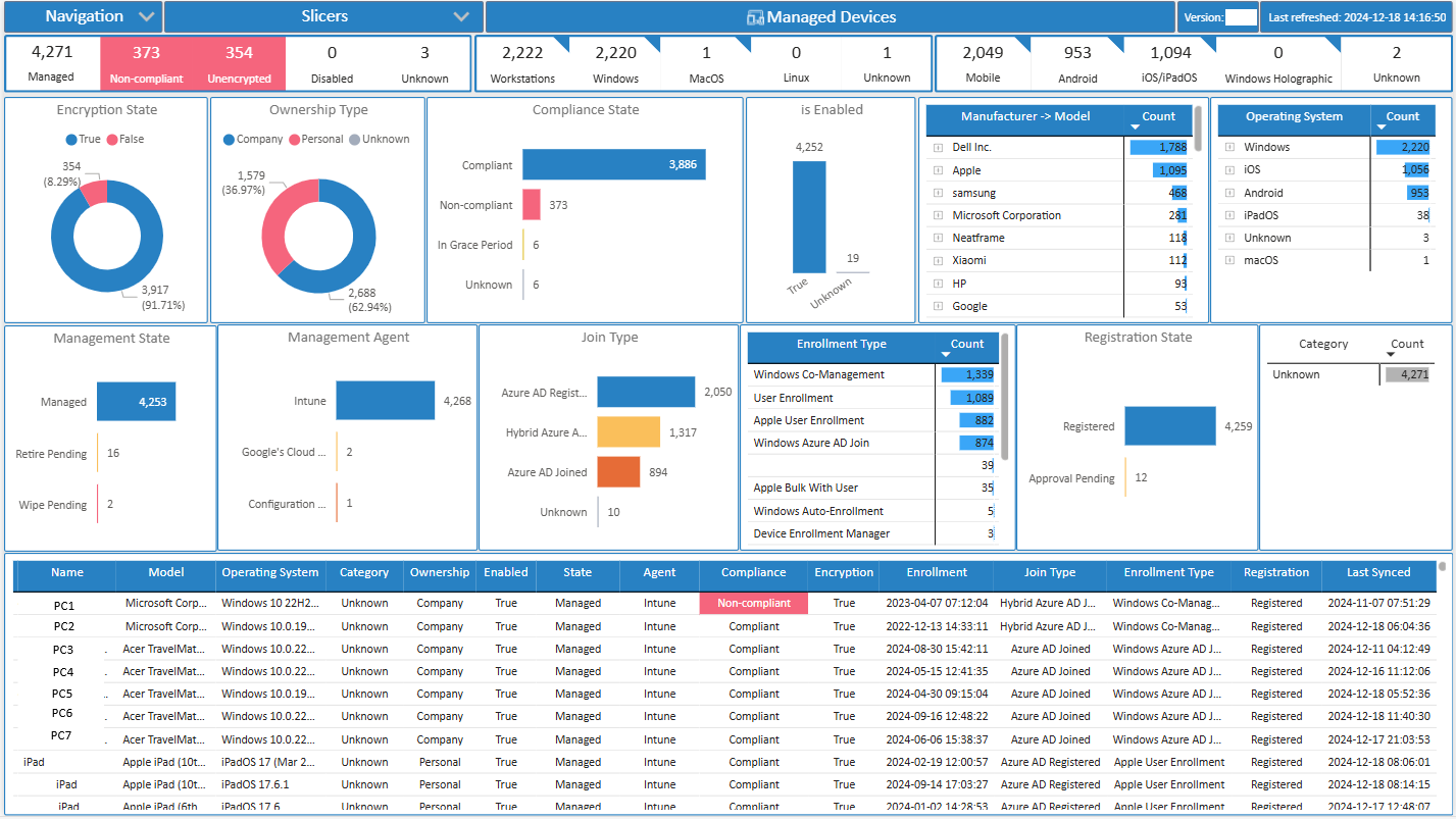
Purpose:
The Managed Devices page provides IT teams with a detailed, device-centric view of endpoint health. It helps administrators monitor compliance, security posture, and operational states across the organization’s device fleet.
What’s in the visuals:
- Compliance & Encryption States – Shows counts of devices that are compliant vs. non-compliant and encrypted vs. unencrypted.
- Ownership Type – Breakdown between company-owned and personally owned devices.
- Operating Systems & Versions – Distribution across Windows, iOS, Android, and macOS with version-level granularity.
- Enrollment Types – Insights into whether devices are Azure AD joined, co-managed, auto-enrolled, or user-enrolled.
- Manufacturers & Models – Drilldowns by vendor (e.g., Dell, HP, Apple, Samsung) and model type.
- Management States & Agents – Status of whether devices are fully managed, pending retirement, or operating with third-party management agents.
Slicers:
 Interactive slicers allow filtering by Device Name / Device ID, Compliance State, Operating System & Version, Manufacturer & Model, Ownership Type, Management State and Categories or Groups.
Use Case Example:
An IT admin investigating non-compliant Windows devices can filter by OS = Windows and Compliance = Non-Compliant. They can then drill into the manufacturers and models (e.g., HP EliteBook) to identify if specific hardware lines consistently fail encryption policies. This enables focused remediation steps or policy adjustments.
7. Users – Insights into User & Device Ownership
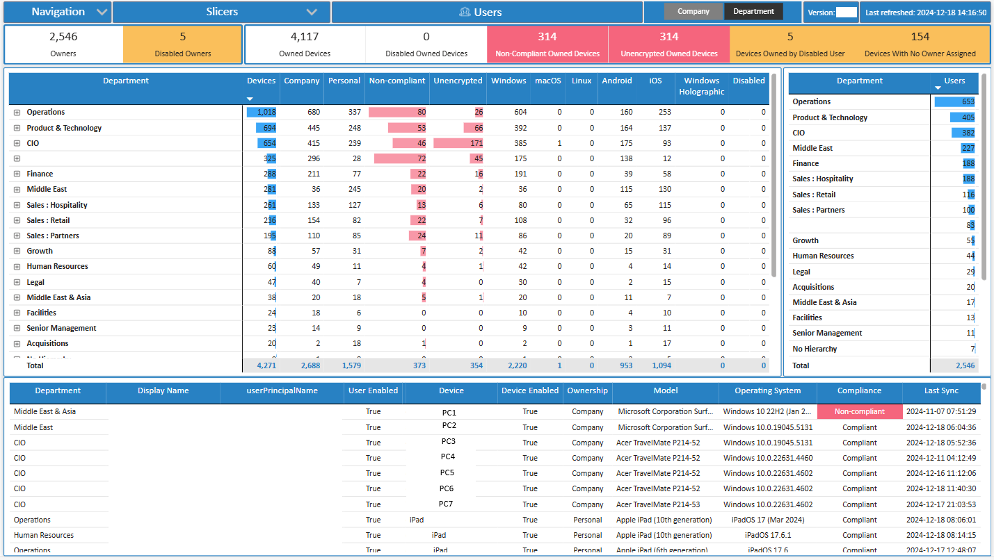
Purpose:
The Users page shifts focus from devices to the people behind them. It correlates device health with user accounts, giving IT teams visibility into risk exposure tied to user activity.
What’s in the visuals:
- Device Breakdown by Department / Division – Helps understand device distribution across business units.
- Disabled Users with Active Devices – Identifies cases where inactive accounts still have devices linked to them (potential security gap).
- High-Risk Users – Spots users owning the highest number of non-compliant or unencrypted devices.
- Detailed User Profiles – Shows user principal name, account enabled/disabled state, owned devices, compliance state, OS version, and last sync timestamp.
Slicers:
Built-in slicers include:
User Principal Name,
Display Name,
Department / Division,
Device Ids and Names,
Manufacturers and Models,
Ownership Type,
Compliance State
Enabled vs. Disabled Account etc.
Use Case Example:
An IT admin performing an audit of disabled users can filter by Enabled State = Disabled and instantly see any associated devices still syncing to the environment. This allows quick remediation by retiring those devices or reassigning them, closing potential security loopholes.
8. Protection State Page
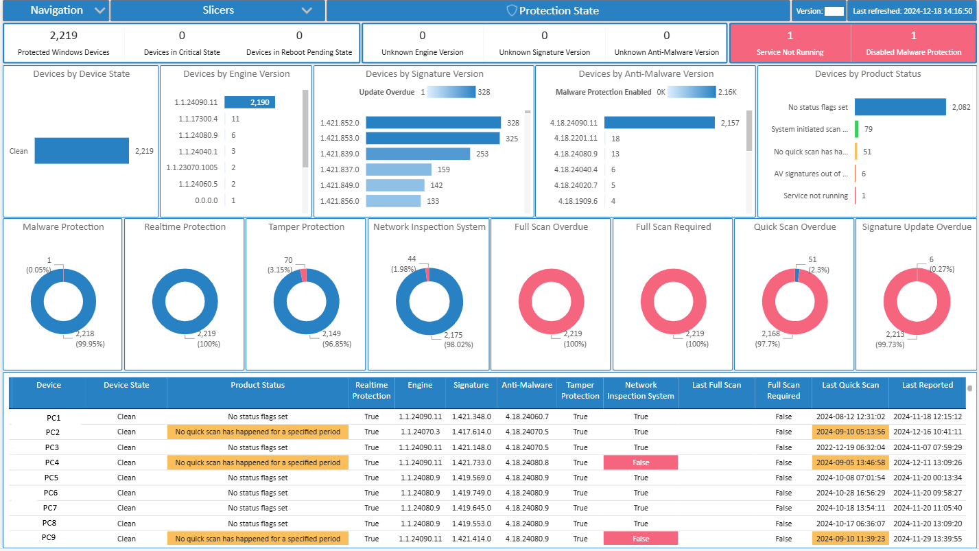
Purpose:
This page gives a high-level security posture overview of your environment by showing the current protection status of devices/users. It answers: Are endpoints protected, at risk, or missing updates/security policies?
What’s in the visuals:
- Pie/Donut Chart: Breakdown of devices by protection state (e.g., Fully Protected, Partially Protected, Not Protected).
- Tables/Bar Charts: Show number of devices with antivirus, firewall, or real-time protection enabled/disabled.
- KPIs: Quick metrics like % protected endpoints.
Slicers:
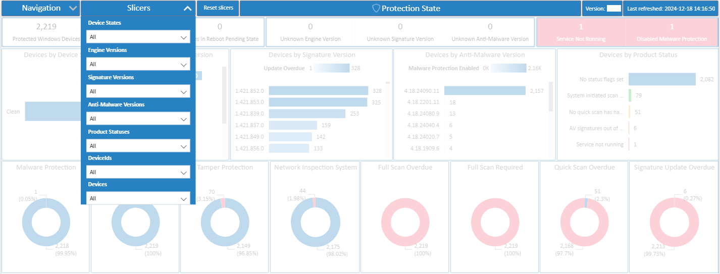
- Filter by Device Group, OS, Policy, or Timeframe to narrow down reporting.
- Let’s IT admins quickly drill into specific areas (e.g., Windows 10 laptops in Finance vs. whole org).
Use Case Example:
If you notice 10% of devices are in a “Not Protected” state, you can slice by department or device type to see exactly where protection is missing, and push corrective policies.
9. Malware State Page
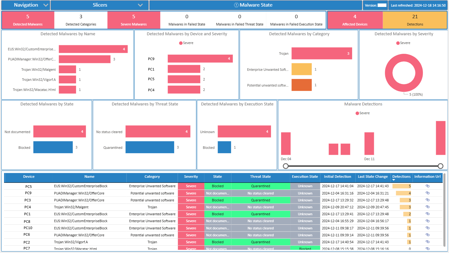
Purpose:
This page focuses on threat detection and remediation status. It answers: How many devices are infected, how many are remediated, and where are threats recurring?
What’s in the visuals:
- Active Malware Count by Device/User.
- Trend chart of malware detections over time (shows infection spikes).
- Table of Device Names with Malware State (Clean, Active, Quarantined).
- Severity-level breakdown (Low, Medium, High).
Slicers:
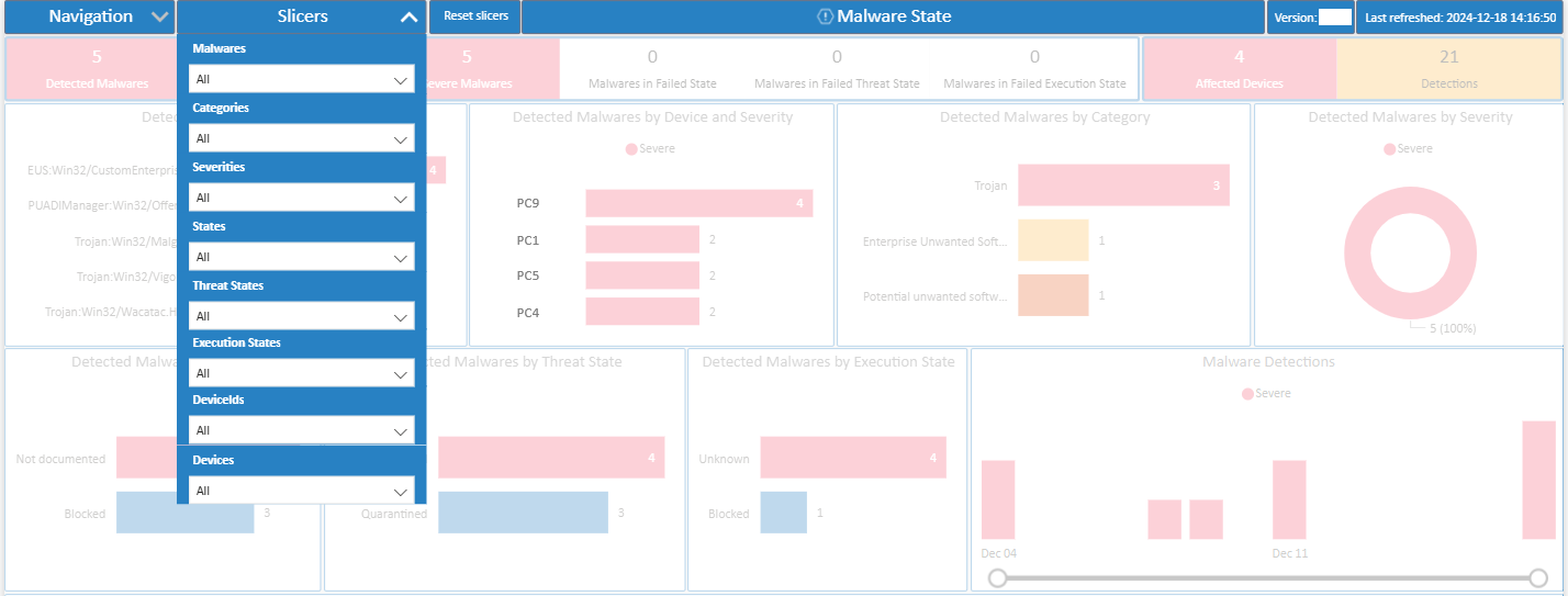
- Filter by Malware Name, Device Group, User, Detection Method, or Date.
- For example, you can select a specific malware family (e.g., “Trojan:Win32/…”) and see affected devices.
Use Case Example:
If multiple devices in the same OU are showing “Active Malware” status, you can pinpoint the infection source (e.g., shared file server or phishing campaign) and act faster.
10. Compliance Page
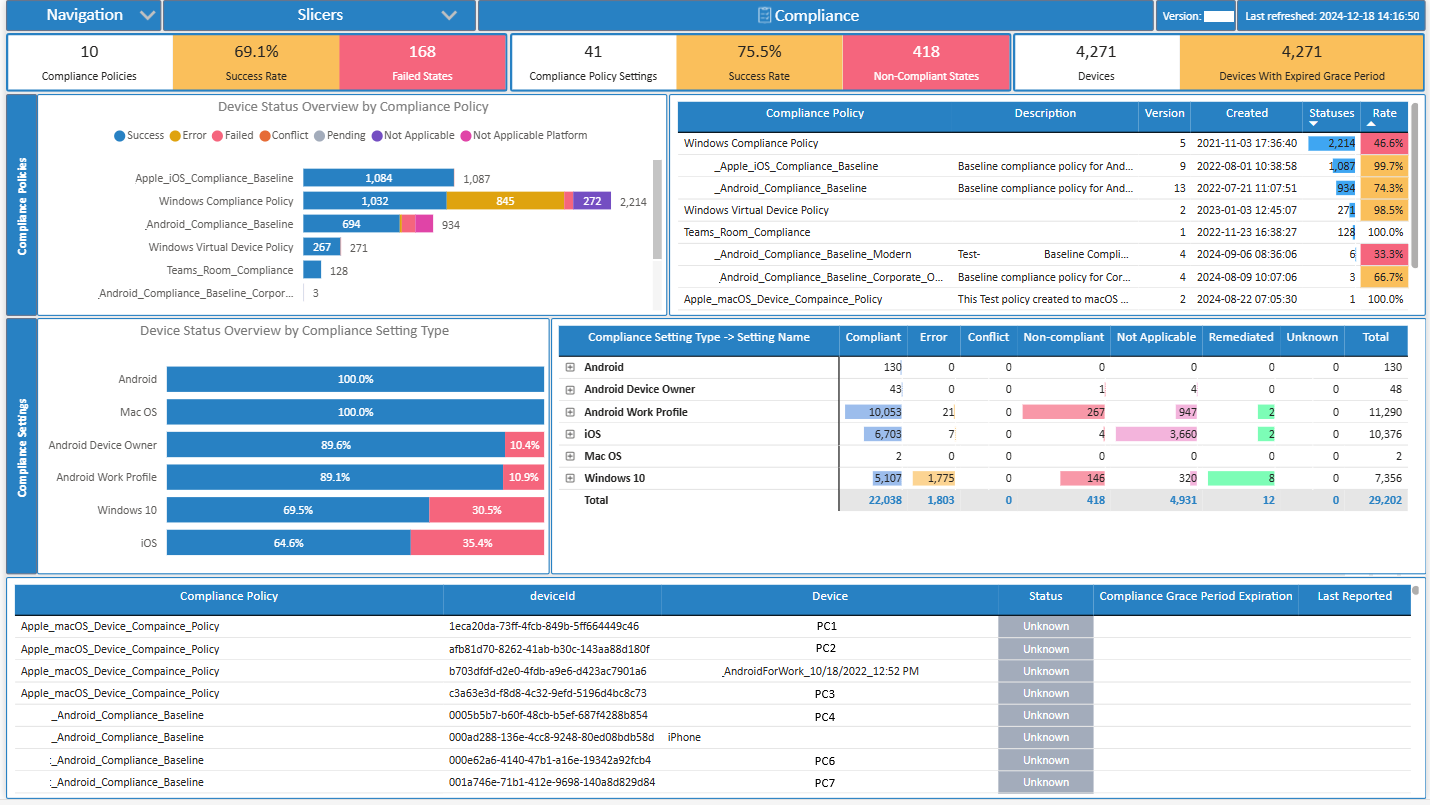
Purpose:
The compliance page measures device adherence to corporate security policies. It answers: Are devices compliant with baseline configurations (patching, encryption, antivirus, etc.)?
What’s in the visuals:
- Compliance vs. Non-Compliance ratio chart.
- Trend graph of compliance percentage over time.
- Non-compliant devices by reason (e.g., Missing Updates, Firewall Disabled, BitLocker Off).
- Detailed grid view of device-level compliance status.
Slicers:
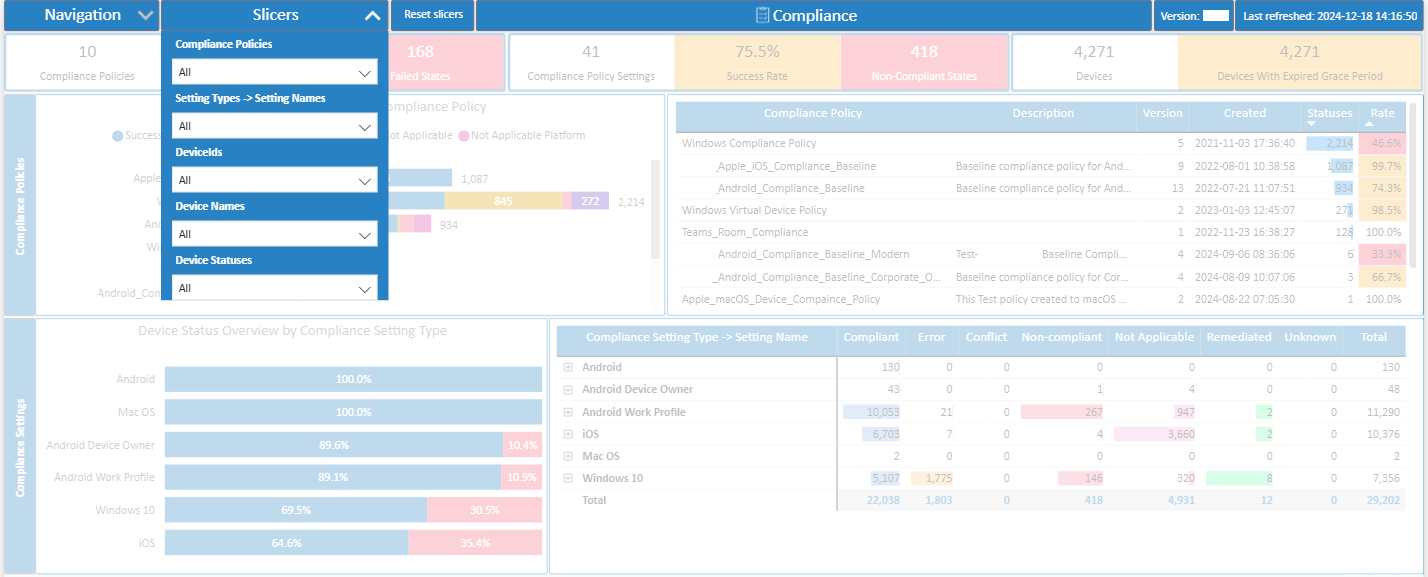
- Slice by Policy Type, Device Group, OS, or Timeframe.
- Example: Check compliance only for mobile devices or Windows servers.
Use Case Example:
If compliance is dropping after a new security policy rollout, slicing by policy type helps identify which new rule (e.g., requiring TPM 2.0) is causing devices to fail.
11. Configuration Page
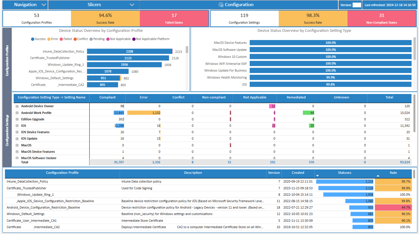
Purpose:
This page digs into security configuration settings of devices. It answers: How are devices configured with respect to antivirus, firewall, encryption, and updates?
What’s in the visuals:
- Firewall Status Chart: On vs. Off across devices.
- Antivirus Configuration Chart: Shows AV status (enabled, disabled, not reporting).
- BitLocker/Encryption status.
- Tables listing devices with missing/incorrect configs.
Slicers:
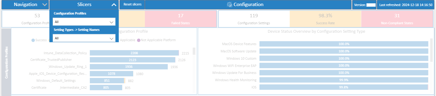
- Slice by OS Version, Config Type (AV, Firewall, Disk Encryption), Device Group, or Date.
- Example: Filter only on servers to see which ones don’t have a firewall enabled.
Use Case Example:
IT can proactively remediate risky configs — e.g., finding 50 devices without BitLocker enabled in Sales laptops and enforcing encryption before audits.
12. Application Protection Page
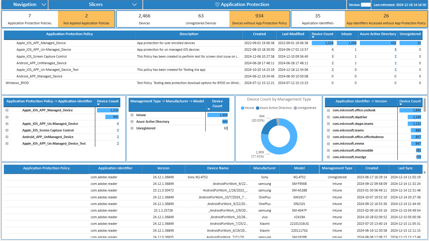
Purpose:
This page highlights app-level security policies and risks. It answers: Which apps are protected, which are being exploited, and how users interact with them?
What’s in the visuals:
- App Protection Policy Status: Devices/apps under policy vs. outside scope.
- Blocked/Allowed app access attempts.
- Top risky apps by device/user.
- App usage trend with applied protection.
Slicers:
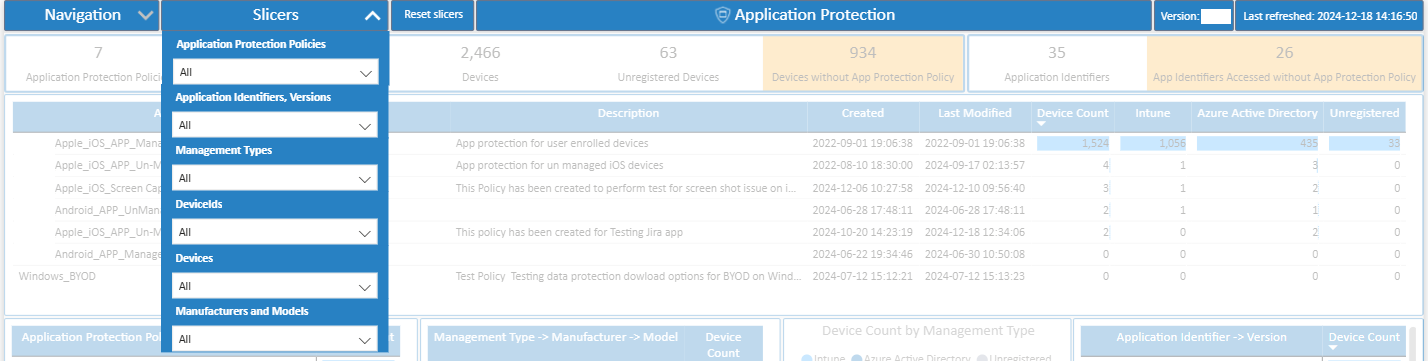
- Slice by Application Name, App Policy, Device/User Group, or Date.
- Example: Select “Outlook Mobile” to see how many users are covered by App Protection Policy vs. running unmanaged.
Use Case Example:
If corporate data leakage prevention policy isn’t applied to Teams Mobile, the dashboard helps flag unmanaged users — so IT can enforce app protection across all devices.
Why This Matters for Your Business?
By implementing this Microsoft Intune Endpoint Analytics Power BI Report, organizations gain:
✅ End-to-End Visibility – From tenant change history to device compliance, security posture, and user activity.
✅ Executive Insights – Summarized overviews for leadership.
✅ Operational Efficiency – Drill-downs for IT administrators to troubleshoot issues.
✅ Proactive Security – Alerts on expiring connectors, malware detection, and compliance risks.
✅ Scalability – Works seamlessly across any Intune tenant, regardless of size.
✅ Customizability – Filters and slicers designed for your business needs.
Simply put: you see everything, you miss nothing.
Final Wrap-Up
Keeping endpoints secure and compliant is no longer optional—it’s mission critical. With dashboards covering Protection, Malware, Compliance, Configuration, and Application Protection, you get instant clarity on risks, compliance gaps, and security posture across your organization. The result? Less guesswork, faster decisions, and stronger protection.
✨ Ready to gain complete visibility into your Intune environment? 📩 Get in touch with us today to discuss how our Endpoint Analytics Report can unlock the full potential of your endpoint data and transform your endpoint management.